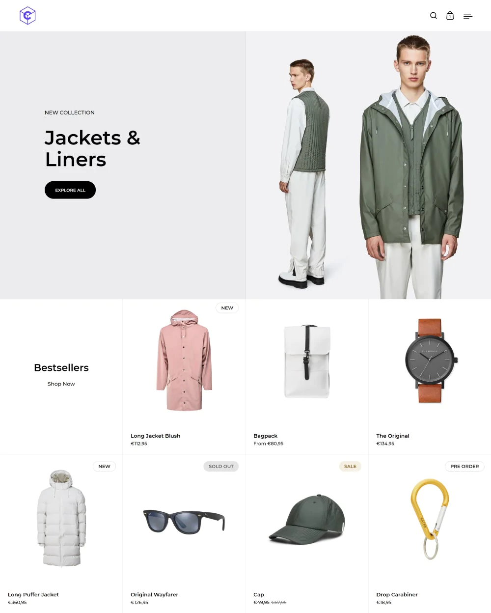
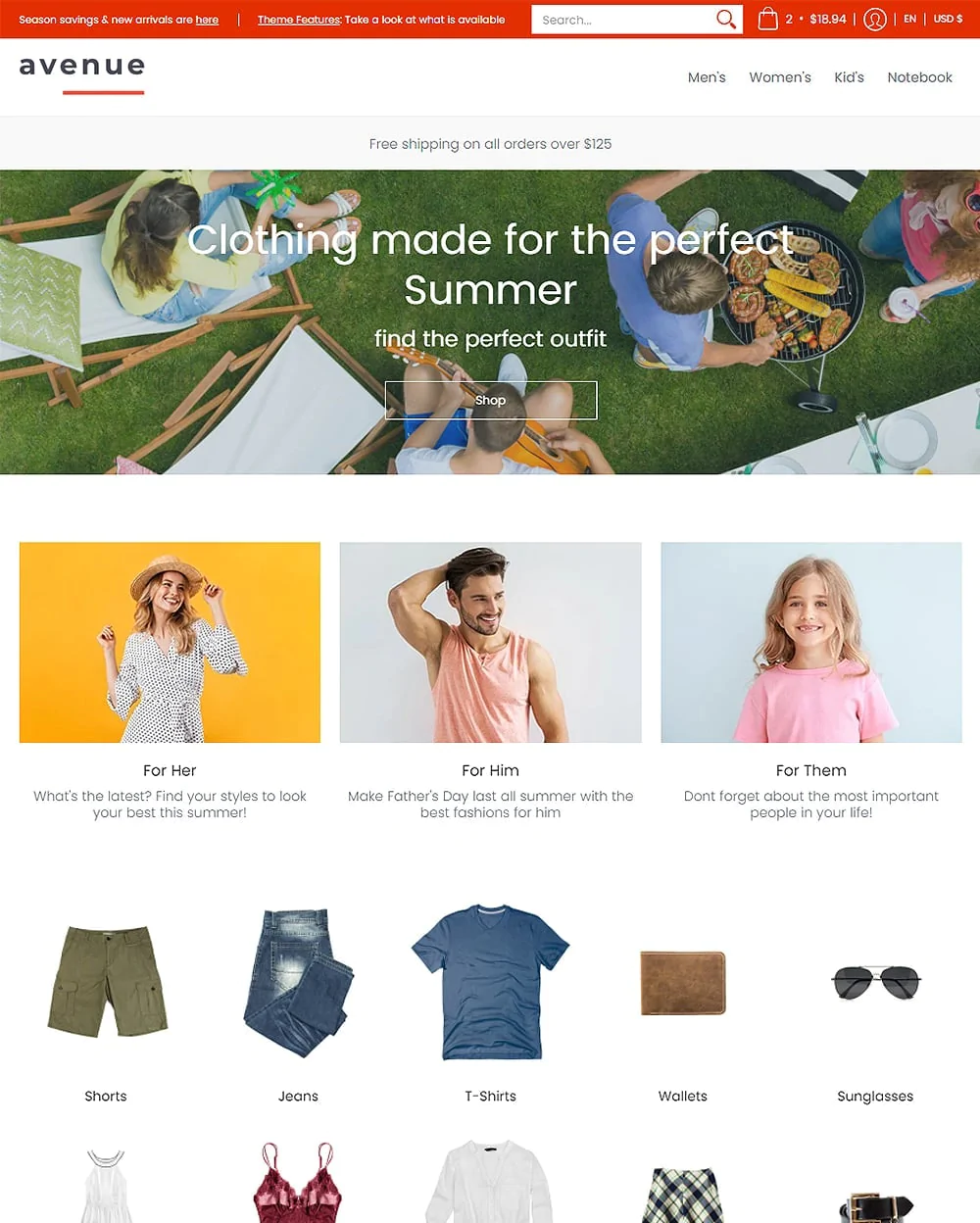
The Responsive Shopify theme is well worth checking if you're searching for top mobile-friendly eCommerce themes to upgrade your store or launch a new one.
The best moment to invest in responsive designs and Shopify responsive themes are now more than ever.
This theme strives to appear amazing on all screen sizes. In particular, it makes it simple and quick for customers to shop, irrespective of the device customers use.
What Is The Responsive Theme?
Responsive Shopify theme from Out of the Sandbox is an eCommerce theme designed to improve your store's visibility across several devices.
It is a technically sound and adaptable theme that complements a variety of products and industries, is responsive, and looks great on all devices.
You can easily and elegantly tell your brand’s story using the layout, font, and featured promotional options that are highly adjustable.
Responsive Shopify theme is the best-reviewed and technically robust Shopify theme. This easily customizable theme looks great across devices and matches a broad range of products and industries.
Your business and products will be placed front and center on this theme thanks to the striking imagery, easy navigation, product image changes, and complete social media integration.
The vivid imagery, easy navigation, product image changing, and comprehensive social integration of this theme will bring your brand and products both front and center.
You can also design unique promos for your store using this theme. To inform your customers about deals, discounts, or new products, you can add graphics and text.
Responsive Shopify Theme Styles
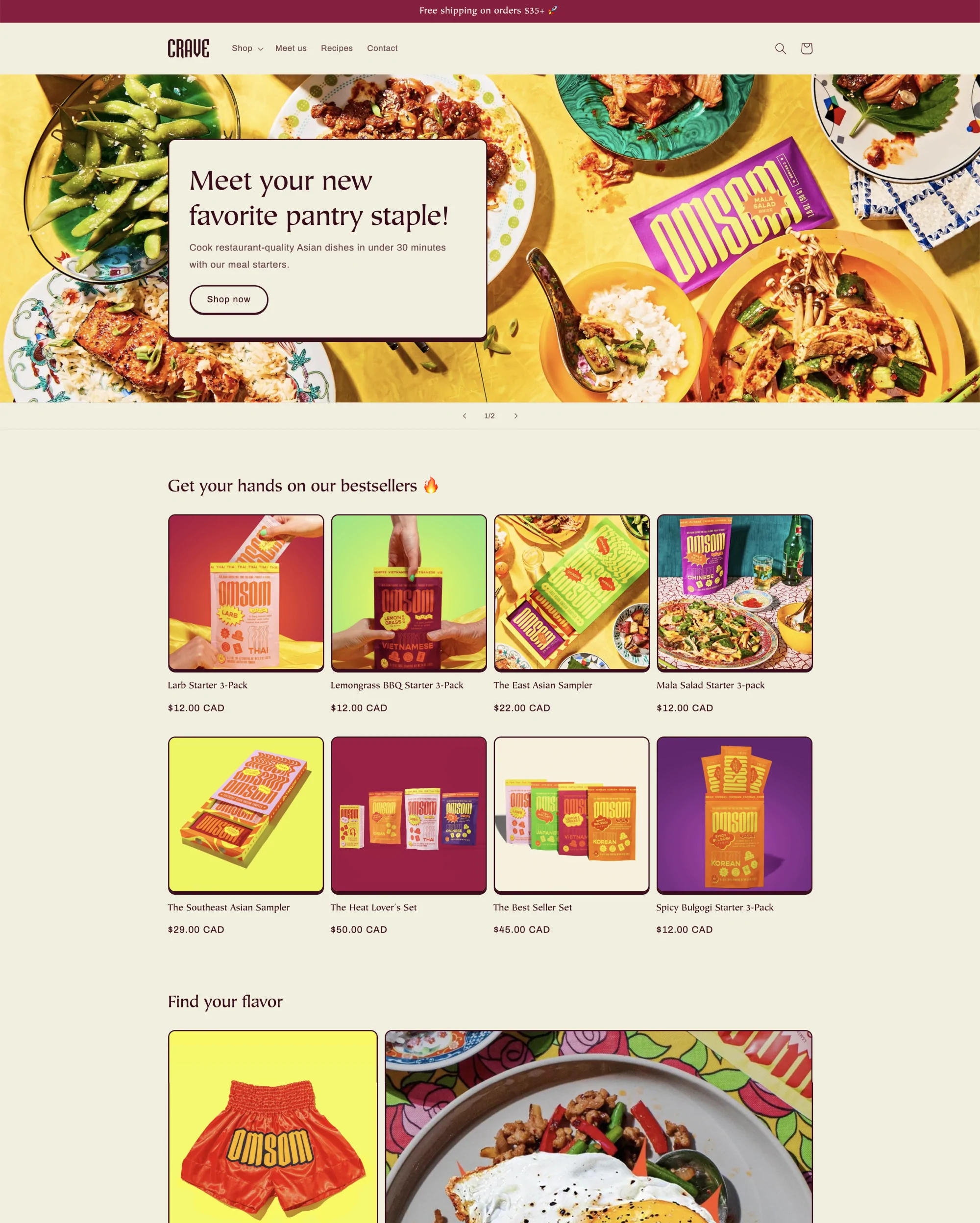
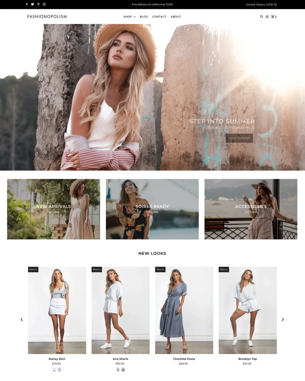
This theme comes with several styles, which are often referred to as presets and have multiple looks or theme styles with varied font, color, and layout groupings.
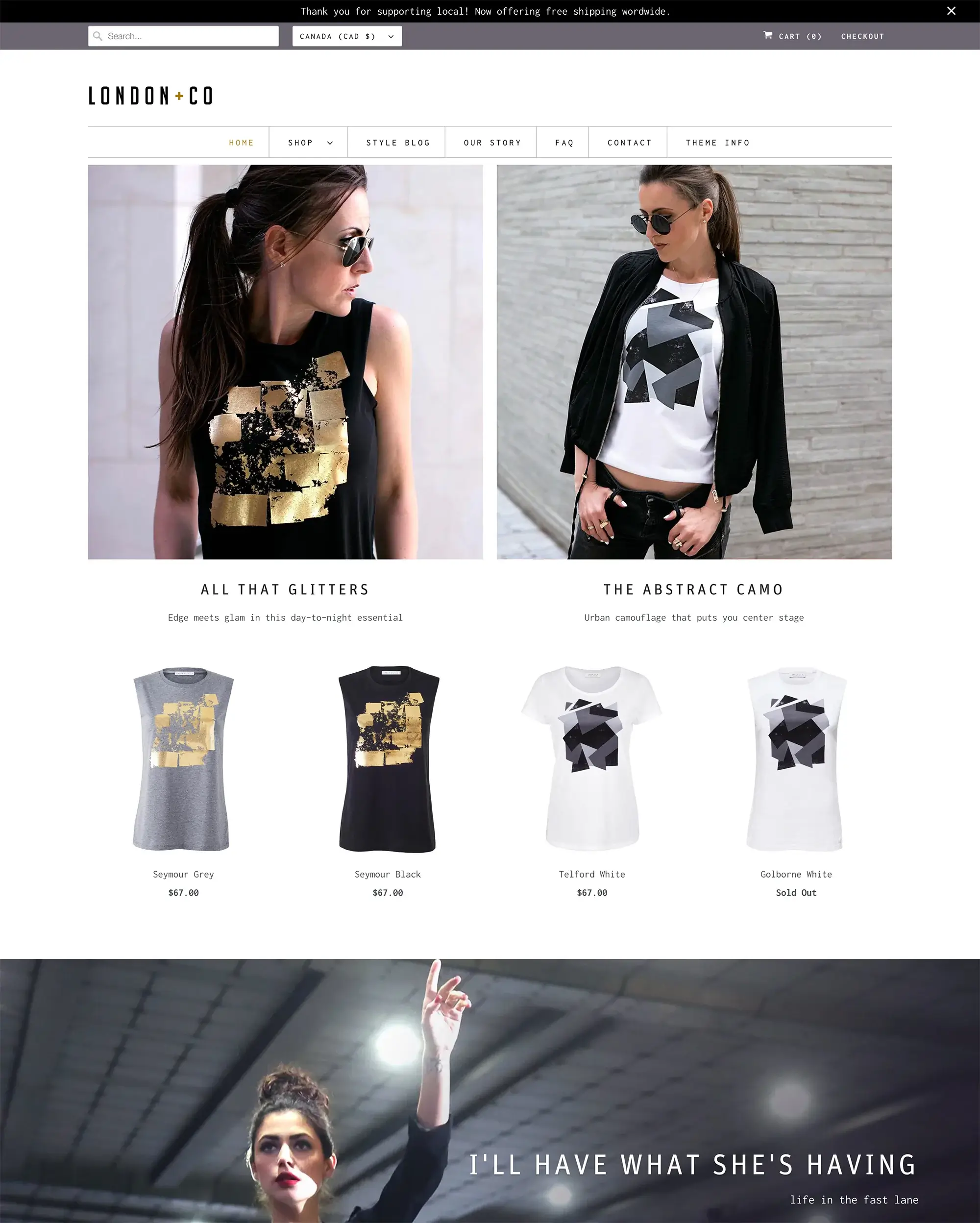
In this case, the Responsive Shopify theme features 4 different styles named San Francisco, London, New York, and Paris styles.
These theme styles showcase the theme's breadth and enable you to pick the finest look for your storefront.
All presets offer the same capabilities; all you have to do is to enable them in your theme settings.
The Responsive Theme Top Features
| Highlights | Details |
|---|---|
| Theme speed | Tested and proven to be fast |
| Integrations | Integrates with high-quality images, including the Burst stock pictures from Shopify |
| Theme flexibility | Highly customizable and ideal for branding |
| Great for | Ideal for stores with high traffic |
| Pricing | Offers unlimited free trial. Pay once the business goes live. The license is worth $220. |
Responsive Shopify Theme Pros And Cons
Pros:
- Displays proficiency in design arrangements that provide a pleasant shopping experience;
- Impressive performance in terms of page load times and navigational simplicity;
- A design that is very mobile-responsive and features elegant styling;
- Supports various inventory/catalog sizes and specialized types.
Cons:
- High-Quality Images might be necessary for the Responsive Shopify theme to look its best.
Responsive Theme Pricing
The Responsive Shopify theme costs $220. Additionally, there are no additional charges after purchase. As soon as you purchase one of the Out of the Box themes, you'll enjoy lifetime customer support.
If you'd like your brand to differentiate itself from the competition, the investment is worthwhile at this price, which is around average for a professional Shopify theme.
Features Of The Responsive Theme
Homepage
Themes with several sections will initially only display a portion. Select Show to make more sections visible.
In the theme editor's left sidebar (Customize), click (+) Add section. Next, pick a segment from the ones that are offered. By section name, search using the search form.
With flexible and adaptable design layouts, the design is highly mobile and responsive. The theme supports a range of image effects, including image rollover, animation, zoom, image galleries, and more, on images (for collections, products, promotional banners, etc.).
Featured items, images, featured collections, customer testimonials, full-width brand videos, blog entries, and many others offer you flexible home page segments for brand and service exposure are available.
Popups for upsell/cross-sell and newsletters appear on all pages.
Product Page
The Responsive Default product template governs the layout, features, and settings of the product page.
The product page, typically referred to as a PDP or product details page, is used by merchants to showcase the characteristics and advantages of each product.
Customers can learn more about a product and add a version to their shopping cart using the features on your product page.
Select the Show thumbnails setting to display images as thumbnails to showcase all of the product media through the quick shop.
The "previous" and "next" arrows for your product media are shown when the "Show arrows" setting is activated.
Enable the Magnify product images with the hover setting so that buyers can zoom in to see your product's images more closely.
FAQ page
The FAQ (frequently asked questions) page layout uses a dynamic, accordion-style layout to display frequent queries and responses from users.
Create a new page from your Shopify admin first, then give it a title. Access the section from the theme templates dropdown menu, choose FAQ, then click Save.
The page templates offered here are admin-only, however, if more content is required, it can be added to show above the FAQ section. Use the theme editor and input your queries and responses there.
If you want to make collections of questions, think about adding heading blocks. Open the Title heading block that is already loaded to edit its content. Change the text in the heading field to suit your needs.
Collection Banner
The Responsive Shopify theme comes with a 'collection banner' template which you can assign to your Collection to show the banner picture.
By default, the banners use the collection's "collection image". You must first create at the very least one collection before you can use the header image.
You must first upload a "Collection image" for your collections in the Responsive Shopify theme. This image is what will display as the banner.
Custom Liquid
The Responsive Shopify theme now has a Custom Liquid section, which is similar to the Custom HTML section and makes it simple to include custom code to sites.
By adding the Custom liquid section to any page and using the supplied field to add additional, Liquid-formatted material, you can avoid making direct theme file updates.
Use the Custom liquid area to enter your code.
Google Maps
You may already be familiar with how Google Maps works, so using this Responsive Shopify theme will allow you to add a Google map segment so you can share your business location for buyers to easily find you.
They will therefore find it simple to examine and find directions to your store's location via Google Maps.
Newsletter Popup
This option to activate a newsletter popup is available in the Responsive Shopify theme. The features in the Responsive Shopify theme's popup are more in-depth here.
Open the Popup section of the Theme options, then turn on Enable popup to enable the Newsletter Popup.
To make the popup visible on both mobile and desktop devices, select Show popup on mobile. To restrict this to desktop devices, disable it.
You can enable the Newsletter signup area by turning on the Show newsletter. With the ‘Show first name’ and ‘Show last name’ settings, add a field for your customer's first and last name.
Mega Menu
The Mega Menu in the Responsive theme is a fantastic tool for highlighting collections and categories. Your customers can swiftly browse across collections of products using mega menus. They are helpful if you want to group items by brand or vendor.
Design a dropdown menu, and then turn it into a mega menu. Next, add a bottom banner and a content column to make the feature your own.
You must first build a menu in your Navigation admin before constructing a mega menu. The range of menu options you intend to include will define how many columns there are in your mega menu.
The mega menu allows for a maximum of ten columns. When viewed on a mobile device, the Mega Menu transforms into a drop-down menu for each column.
If you've enabled them, your content column along with the bottom banner will still appear here.
Quick Shop
You can quickly and simply read a product's details from the cart page and thereafter add it to the cart without ever leaving your current page by using the Quick Shop button that has been placed on your website.
Customers can quickly view product details using the Quick Shop function by lingering over the product's image rather than going to the product page.
Additionally, Quick Shop helps shoppers easily select and add items to their shopping carts from your collection page.
Blog Setup
Your store will by default have a titled "News". You can make your own under a different name or choose this one.
To add a blog visit your Shopify admin and click the online store option then choose blog posts. Next, click ‘manage blog’ and select add blog button.
Assign a name to your blog and decide how you wish to handle comments. And remember to save your blog.
You can add content to the post inside the blog post admin page. This field makes use of the rich text editor that makes formatting your posts much easier. Additionally, you can choose to include a link, an image, or other media.
Product Media Types
Videos, 3D models, and photos can all be used as product media. By using product media, you can provide your customers with a better picture of what your products are like and how they look in real life.
A product can have videos, up to 250 images, or 3D models. The Responsive Shopify theme version 7.2.0 now includes support for product media.
There are 3 different types of product media: images, videos, and 3D models.
Images
You'll likely be far more familiar with product media in the form of images. These are the pictures that show off your merchandise.
While the Responsive Shopify theme has a setting for "aligning the height of product photos" on Collection pages, for the best results, we suggest uploading product images with the same size and using a constant aspect ratio, meaning height-to-width ratio.
Videos
You have two options for including videos with your product: either upload a video file or incorporate a YouTube video link. Make sure your video files comply with the following standards before uploading them:
You can step this standard if you’ll be embedding YouTube videos.
3D models
Virtual three-dimensional representations of an item are called 3D models. They enable you to view the item from any position.
You can also provide your buyers with a greater understanding of the scope, scale, and level of detail of your items by using 3D models.
Before adding your 3D model files to your online store, make sure they comply with the following requirements:
Responsive Theme Support
As stated in our support policy and terms & conditions, Out of the Sandbox support does not include phone, live chat technical, and sales help to preserve the greatest value possible for their customers.
However, you can always contact them by email or through their support center. Requests will only be handled via email. For sales and technical concerns, Out of the Sandbox does not offer phone and live chat help.
Final Thoughts
The Responsive Shopify theme is among the simplest and most user-friendly templates available. It enables you to showcase your items and brand personality in an engaging way that encourages shoppers to scroll down for more.
Make sure your homepage is filled with high-quality images of your products, lifestyle photos to complement them, and videos.
The Responsive Shopify theme includes all the design options and features you need as a store owner, including multi-column submenus and multiple action buttons.
It features a limitless number of customization choices, is mobile device optimized, and offers a fast loading speed.
